Design Description - Dark Floral


"If there’s one thing I’m really proud of about this print, it’s that it’s inspired people to do some beautiful and imaginative things with their surroundings. I hope it will inspire you too!"
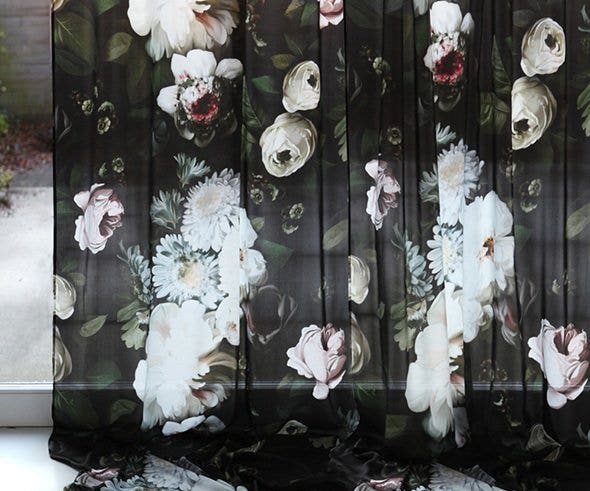
I painted ‘Dark Floral’ in 2013, when I was first becoming interested in the still life paintings of the Dutch Golden Age. Here, a majestic, ethereal bouquet of peonies, roses and daisies cascades softly down a dark, shadowy background.
‘Dark Floral’ is the original design that launched my label in 2013, when it went viral on Pinterest. Since then, I’ve tried to figure out exactly what it is about this print that causes people to react so strongly. I think there are several things that make it work especially well.
‘Dark Floral’ has a classic elegance, a dose of drama and romance, and a three-dimensional effect that gives depth to any space. It also has an incredibly versatile color palette.
It’s essentially black and white, and is complimented by warm, earthy greens in the foliage behind the flowers, pops of red at the center of a single flower, and pastels (light blue, yellow, pink, coral and off-white appear on other flowers).
This makes it possible to combine ‘Dark Floral’ with black and white to offset a stark, contrasty and minimal interior; with neutral colors for a toned-down and timeless interior; with pastels for a soft, feminine interior, or with bright reds and greens for a bolder look. For a classic, elegant look, combine it with gold or brass. Toughen it up with concrete floors. Complete the look with low lighting and a bouquet of fresh flowers.
We can’t wait to see what you do with it!


 Canada (CA)
 United Kingdom (UK)
 United States of America (US)