Rose Decay

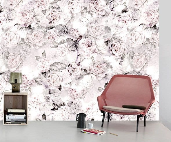

"‘Rose Decay’ began as a quiet little watercolor painting of roses. Initially, I painstakingly painted smooth surfaces, subtle color gradations and soft lines."
Once the ‘perfect’ rose painting was complete, I was inspired to spill water onto the paper, causing the colors to bleed together. A controlled, precise painting technique gave way to the unknown.
In the process, the paper was damaged and torn, and later collaged back together to create this wallpaper design. Peeking through are parts of the original painting that managed to survive the ‘damage’, which is, of course, beautiful in and of itself.
‘Rose Decay’ incorporates a palette of light to deep pinks and grays, black and white. It’s a floral design that’s at once soft and edgy.
I imagine my rose print in an unfinished space, with exposed ducts, concrete floors or walls. It gives this kind of space a certain softness and femininity while still maintaining an edge, and it speaks to the idea of layers that are both added and exposed.
I envision ‘Rose Decay’ surrounded by cool tones of white, gray and black. It mixes well (and maintains its edge) with bold, graphic, black and white prints, like Moonlight Meadow Black, or Twisting Tulips.
I always like to pair my florals with with ‘hard’ materials: ‘Rose Decay’ looks great with metal fixtures and furniture, stone tiles and concrete floors, for example. We can’t wait to see what you do with it!


 Canada (CA)
 United Kingdom (UK)
 United States of America (US)