

Shopping Cart
(0)
How to Choose the Perfect Wallpaper Color for Your Space
Selecting the right wallpaper color is one of the most impactful steps in transforming your space. Whether you’re seeking a bold, dramatic statement or a soft, serene backdrop, Ellie Cashman’s luxury wallpapers offer a stunning array of options. From dark, moody hues to light, airy tones, this guide will help you choose colors that complement your decor and reflect your personal style.
Choosing the Right Wallpaper Color
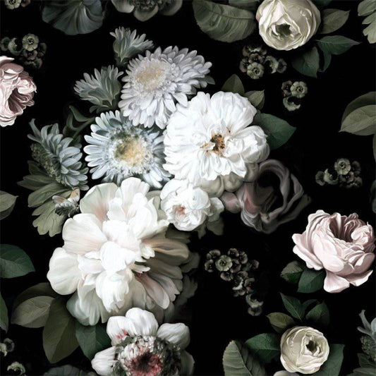
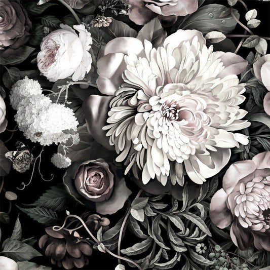
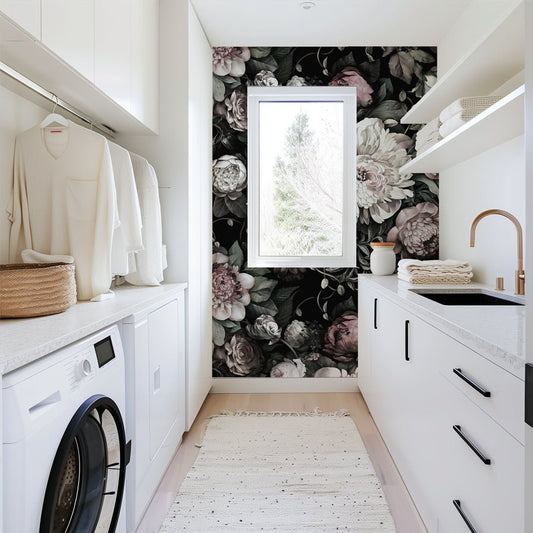
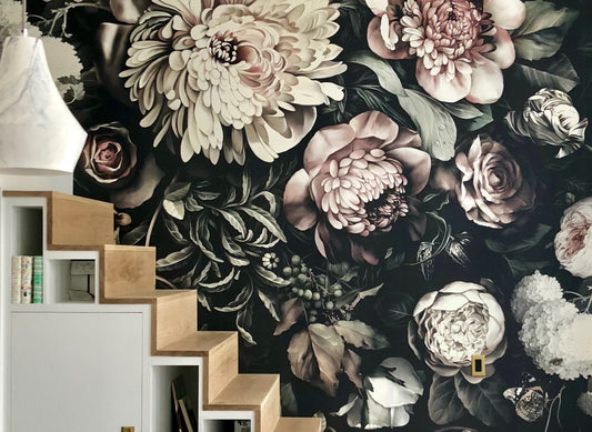
Dark Colors
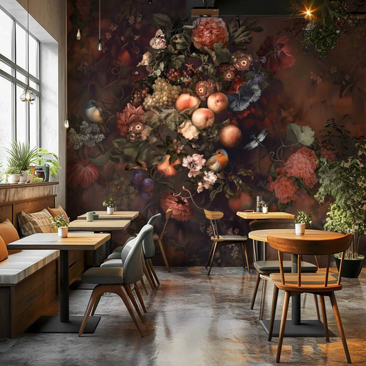
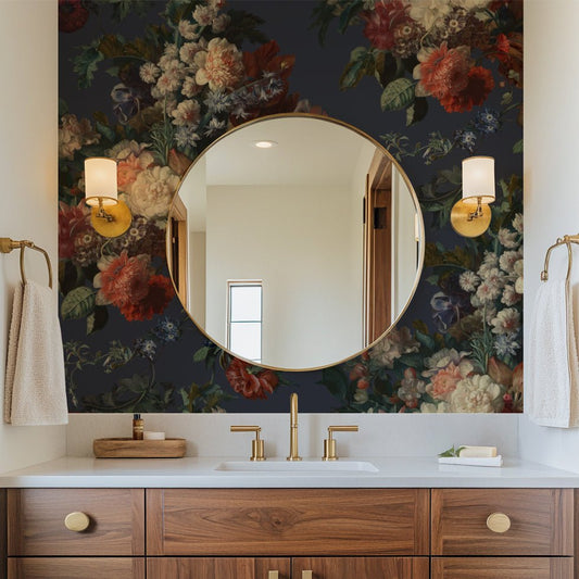
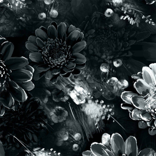
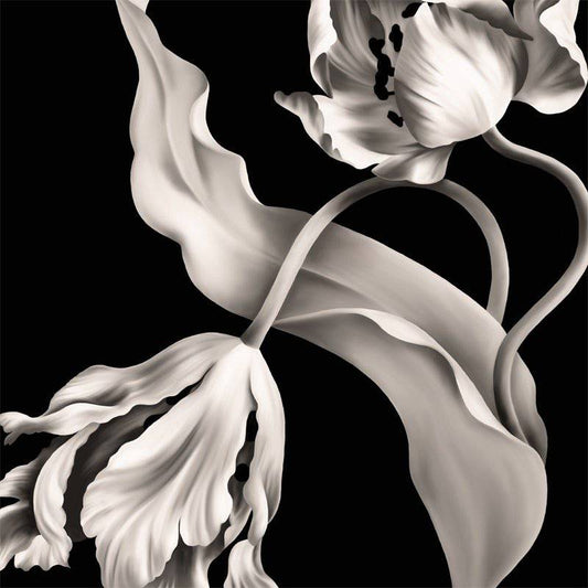
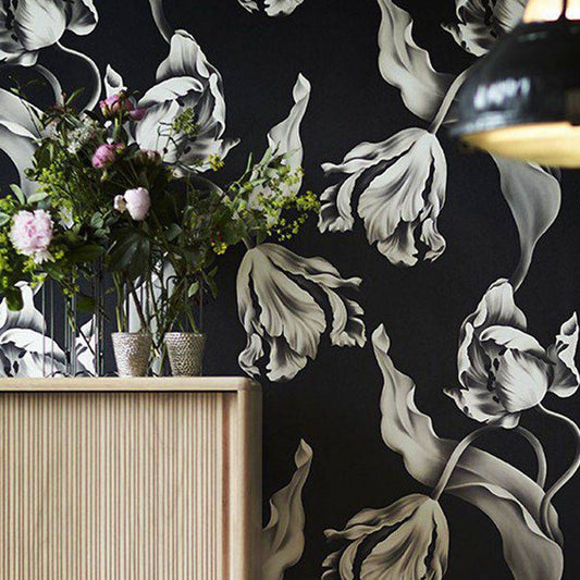
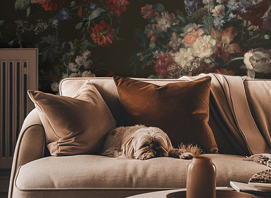
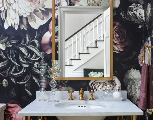
Dramatic and sophisticated, dark tones like deep green, navy, and charcoal create an intimate and elegant atmosphere. They’re ideal for cozy spaces like bedrooms, formal dining rooms, or feature walls in living areas.
- Best For: Bedrooms, dining rooms, and home offices.
- Pair With: Metallic accents, neutral furniture, and rich wood tones for a refined look.
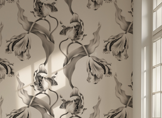
Light Colors
Light and neutral shades like soft gray, blush pink, and pale blue reflect natural light, making spaces feel open and airy. They’re perfect for smaller rooms, entryways, or creating a calm, serene vibe.
- Best For: Entryways, living rooms, and bedrooms.
- Pair With: Pastel accents, light wood furniture, and natural decor for a soft, inviting aesthetic.
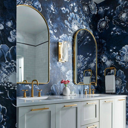
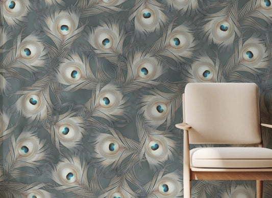
Bold Colors
Bright, vivid tones like magenta, teal, or mustard add energy and personality to a space. Perfect for accent walls or statement ceilings, bold colors bring creativity and vibrancy to your design.
- Best For: Entryways, dining rooms, and creative spaces.
- Pair With: Neutral furniture and complementary tones to balance the vibrancy.
Coordinate Wallpaper Colors with Your Decor
Achieving a harmonious look is easy when you consider the other elements in your space:
- Walls and Trim: Use contrasting colors to make the wallpaper pop or match tones for a blended, seamless effect.
- Furniture: Complement the main furniture tones—light wallpapers contrast beautifully with dark wood, while bold designs pair well with neutral furnishings.
- Accessories: Tie the room together by coordinating rugs, lamps, and artwork with wallpaper hues for a cohesive look.
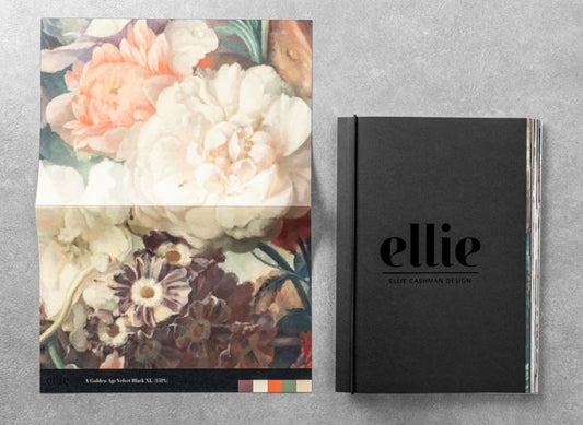
Use Wallpaper Samples for Perfect Color Coordination
Wallpaper samples are a practical tool for finding the perfect color match:
- Test in Your Space: Tape samples to your walls to see how colors interact with your lighting throughout the day.
- Visit the Paint Store: Bring samples to your local paint store to select complementary or matching paint colors.
- Compare with Furniture and Decor: Match samples with your furniture, curtains, and accessories to create a harmonious design palette.
Color Inspiration Based on Room Type
The function of a room can guide your color choices:
- Bedrooms: Soft, calming tones like blush pink or light blue create a restful retreat.
- Living Rooms: A balance of light and dark colors adds depth and versatility.
- Dining Rooms & Offices: Dark, rich hues like deep green or burgundy bring warmth and sophistication.
Layer Colors for Visual Interest
Elevate your design with layered color schemes:
- Monochromatic: Combine light and dark shades of the same color for a timeless, sophisticated look.
- Analogous: Use colors next to each other on the color wheel (e.g., blue and green) for a cohesive, harmonious palette.
- Complementary: Pair opposite colors (e.g., teal and orange) for a bold and balanced contrast.

Ellie’s Tip
Order samples to see how your chosen colors appear in your space’s natural and artificial light. Take your samples to the paint store to find the perfect coordinating paint colors for walls and trim. Testing samples ensures your wallpaper matches your vision perfectly.
Ready to Transform Your Space?
Explore Ellie’s wallpaper collection to discover your perfect color match, or book a 1:1 consultation with Ellie Cashman for personalized design advice.