Wallpapers designs with Viva Magenta, Color of the Year 2023
“A close relative to carmine, crimson red or deep raspberry, Viva Magenta, Pantone’s Color of the Year 2023, exudes a sense of va-va-voom. Likened to “a fist in a velvet glove” by Pantone Color Institute Executive Director Leatrice Eiseman, the beauty of Viva Magenta is its ability to playfully position itself on either side of seeming dichotomies. Indeed, the color is bold enough to break the mold while remaining inviting, accessible, and surprising across a wide variety of contexts and applications.
“It’s a nuanced crimson red tone that presents a balance between warm and cool, making it what we call a hybrid color,” Eiseman says. “It’s audacious, it’s witty, it’s inclusive of all…it’s an easily embraceable color.” — Architectural Digest
We saw that gorgeous, intense pink in Valentino’s Spring Summer 2022 Collection, and interior trends tend to follow closely on the footsteps of their fashion forerunners. So maybe it’s not surprising that Pantone has gone in the direction of this bold and fearless pink.
Because let’s be honest, this is a departure from the kinds of pink that we tend to see in our interiors: the softer, sweeter sort. Pink is a warm color, signifying love, caring, joy, and gratitude. Historically, its been easy to incorporate into every room in the home, in shades that you might call soft, delicate, demure, feminine, gentle, restrained, soothing, caring, friendly … Maybe even Barbie, or bubble gum?
By contrast, Pantone’s Eiseman calls Viva Magenta “a fist in a velvet glove.”
Viva Magenta is a pulsating color. It’s exuberant, and promotes joy, optimism and a feeling of celebration. It packs a powerful punch, encourages experimentation and self-expression without restraint. The effect is electrifying and statement-making. An interior that incorporates Viva Magenta says of its inhabitants that he/she/they have a passion for life and live it rebelliously, to its absolute fullest. It feels like a breakthrough, bust out color.
I love thinking about how this color speaks to where we are socially and emotionally in 2023. We’ve come out of lockdown(s) and want to throw off the shackles of our confinement … Indeed, we want to live rebelliously and without restraint. Our long-held beliefs about gender and femininity are undergoing a seismic shift. Women are fighting for the right to make choices about their own bodies. Over the past several years, the Covid-19 pandemic and the Dobbs decision have had similar consequences, in that they have forced us to live with losses of freedom that we hadn’t anticipated. So, it’s no time for a quiet color.
Right. But back to our interiors.
Architectural Digest notes that “The Pantone Color of the Year 2023 is also ‘gorgeous’ on glassware or anything else with a reflective surface.” Personally, I love the idea of a shiny red metal or red satin cushions/sheets, as bold accents in a space with a deep, dark, burgundy red or rich eggplant wallpaper as a backdrop … I like the idea of going deep and dark, and grabbing the strong pink and bright, shiny reds as highlights. Let’s throw in some crushed velvet and gold embroidery for good measure. I’m seeing a space that is incredibly rich and romantic, dreamy and decadent. I do believe I’m seeing a bedroom.
It might take a little bit of bravery to fully embrace the strong pink, but to help us envision the possibilities, Pantone has placed its 2023 Color of the Year into four distinct palettes:
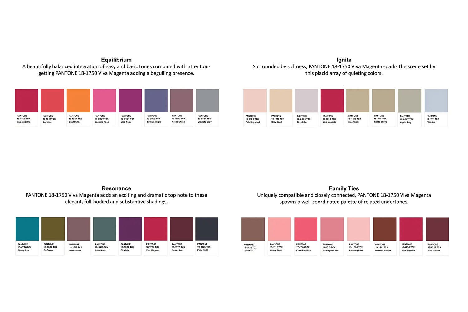
It adds a spark of fire-y color to the otherwise calm, neutral-leaning Ignite palette.
It blends and harmonizes with the whole spectrum of flesh tones that compose Family Ties.
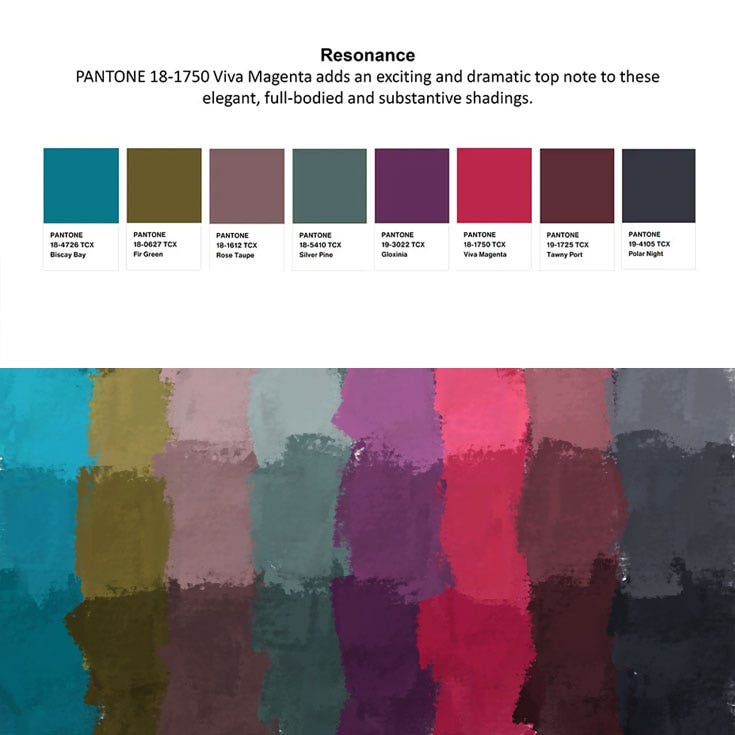
Viva Magenta adds a bit of drama to the row of rich hues that make up Resonance (my favorite).
In Equilibrium, Viva Magenta slips seamlessly into the uniformly warm palette.
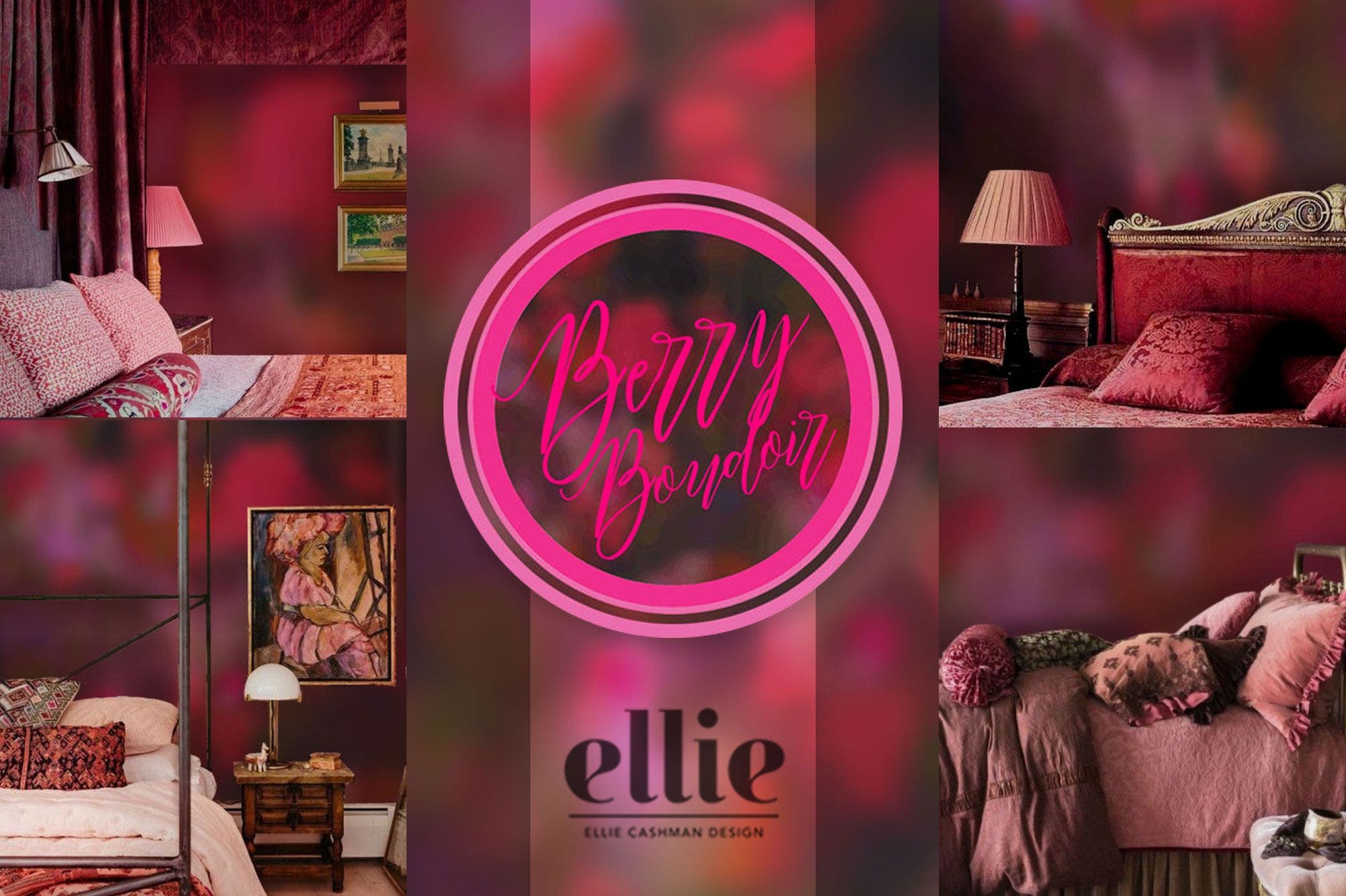
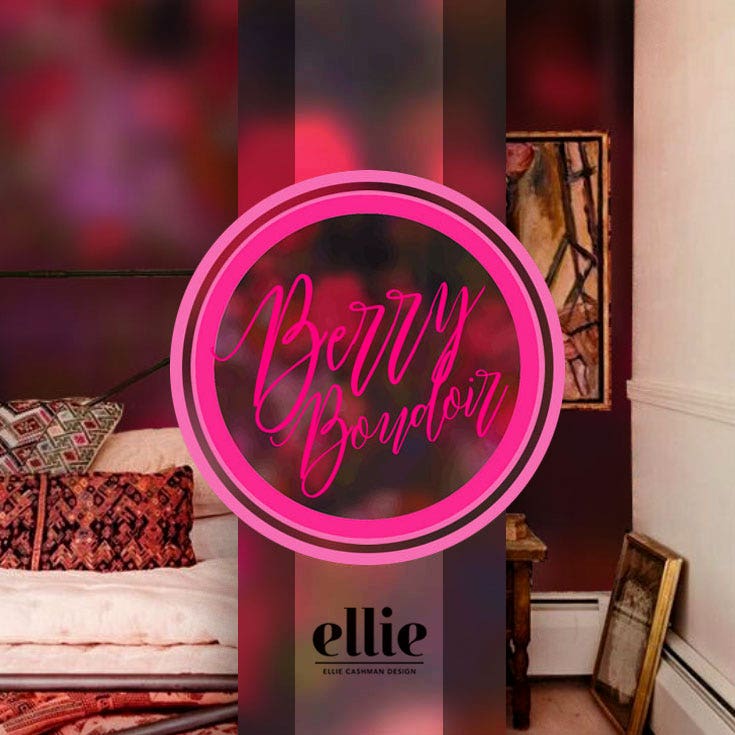
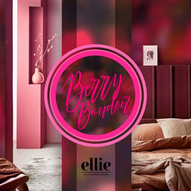
The palette I think I’ll run with, as I start on some new designs in 2023, is Resonance. I’ve got a rich and romantic bedroom wallpaper in mind, which I’m calling ‘Berry Boudoir’.
In general, I do believe that color is incredibly powerful. We absorb and reflect the colors we surround ourselves with, so it’s important to choose the ones that make us feel happy and well.
What do you think? Are you ready to embrace pink in your interior? If so, which palette appeals to you the most?
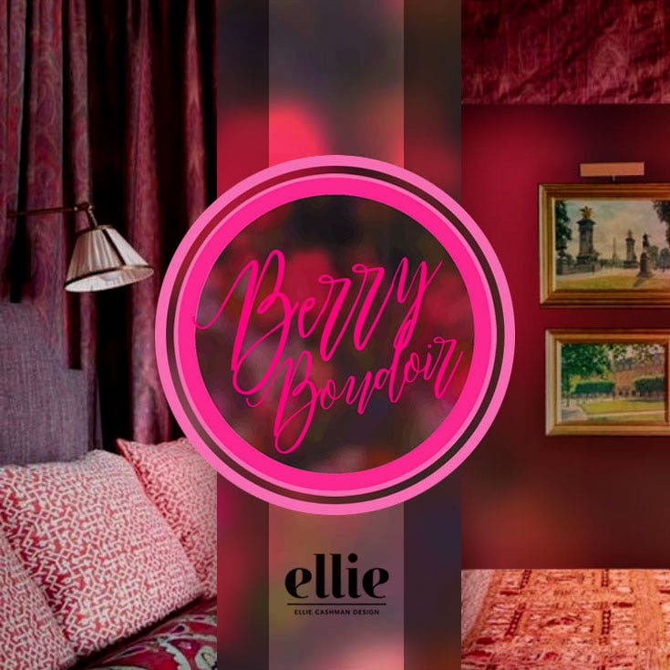
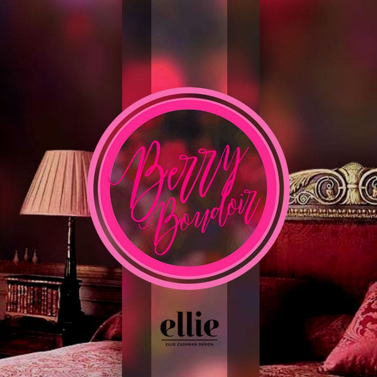
For more inspiration, please visit my Pinterest Boards ‘Powerful Pink Interiors’ and ‘Berry Boudoir’.
Stay wonder-ful,
