9 December 2021
in Note book
Why use blue in your interior?
The spaces that blue loves best
There are a lot of reasons to incorporate more blue into your interior, but certain spaces benefit most from blue, the world’s most beloved color. (45% of men and 35% of women worldwide rank blue as their #1).
I, for one, am deeply into blue at the moment!
Some spaces where blue is at its best are:
1. Small, dark spaces. Blue is the easiest color to see in the dark. It’s the first color we see at dawn, and the last one we see at dusk. This is because it has a short wavelength. It evades absorption, is quickly reflected, and is therefore readily visible to our eyes, even in the lowest light situations. This means blue has an ability to make a dark space feel lighter and more colorful. Not to mention: we intuitively associate it with the sky and the sea and with big, wide, open spaces. It’s a color with incredible depth, inviting us in. These are just a few great reasons to try blue in a small space, if you’d like to make it feel warmer, bigger, deeper, more elegant, more inviting and more colorful than ever before.
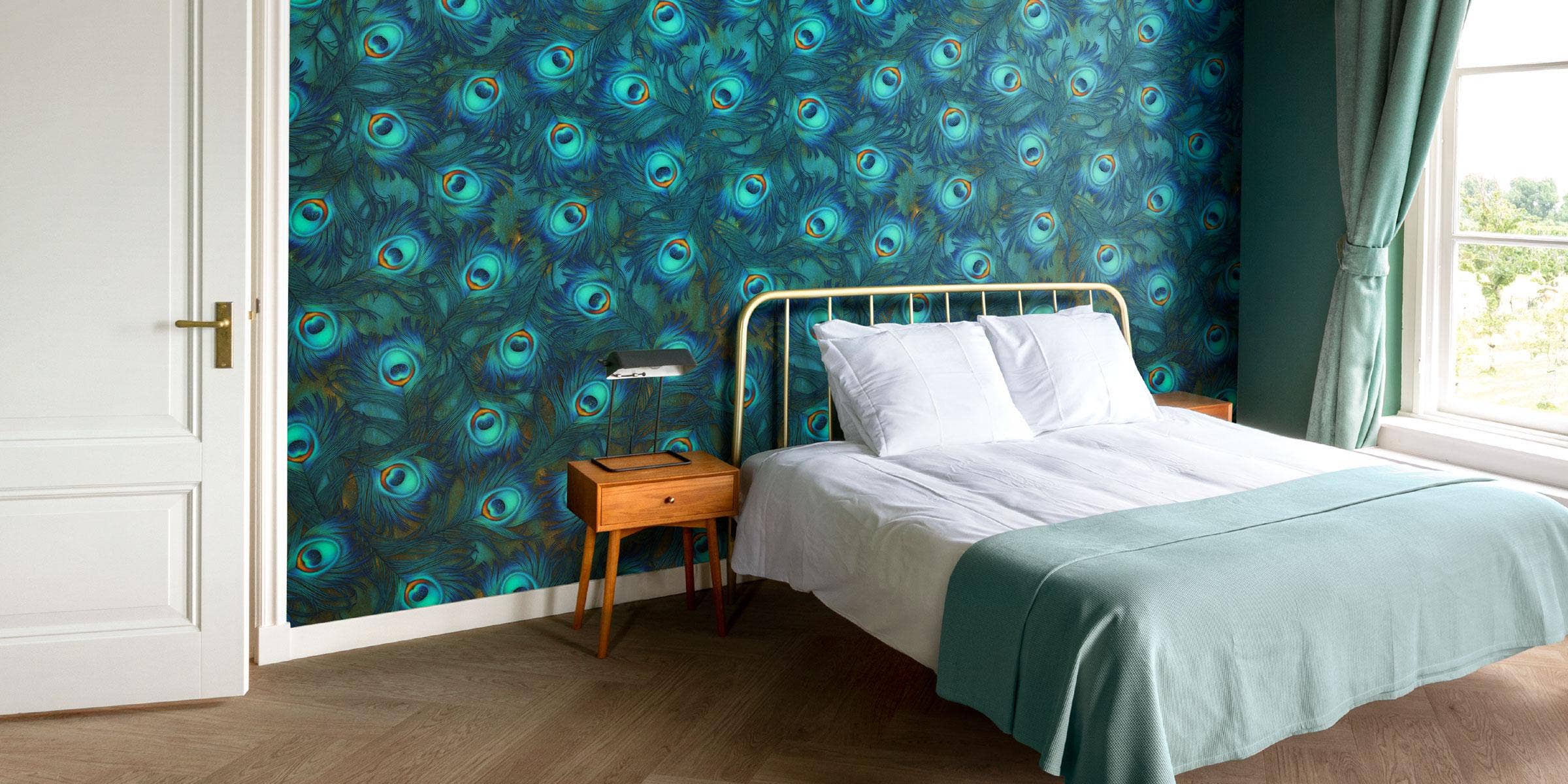
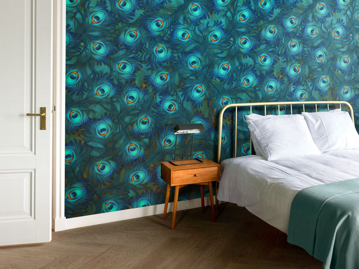
2. A bedroom space. Blue has a positive effect on our physical and spiritual health, so we should apply it to the spaces we’re spending most of our time in. Blue lowers our heart rates, slows our respiratory rates and balances our melatonin levels. In the morning, when our melatonin levels are low, blue will elevate them, making us feel more energetic. In the evening, when our melatonin levels are high, it will draw them down, which calms us and helps us fall into a deep sleep. Basically, blue regulates our energy levels and gives us a sense of consistency, stability and calm. This makes blue the ideal color for a bedroom that will help you relax, restore and recharge, so that you wake up every day feeling your best, and your healthiest.
Plays well with others.
One of blue’s greatest qualities is that it goes with just about every color on the color wheel. Think about it - it’s really hard to clash with blue! But I have my favorite pairings: I love to pair blue with gold or brass accents for a special, elegant, and more formal-feeling interior. For a more casual space, you can’t go wrong when you pair it with balancing browns, like those you find in any shade of wood. Blue is your Heaven; brown is your Earth. These are two tones joined in millions of years of blissful matrimony. You can never go wrong when you emulate color combinations found in Nature.
A healing bath of blue: the water color.
In our showroom, we combined a wall of Becoming Wild in Wavy Blue with walls painted in a deep blue and door handles/a hanging lamp in gold and brass. Being in the space, especially at night, is like being submerged in a healing bath of blue. Everything about this color says water to me - and we know that the sensory experience of water - the sight, sound, feel, taste and smell of it - is soothing and refreshing. Water is our ultimate life source: we evolved out of it, millions of years ago, and to this day it makes up up to 60% of our body’s composition. It makes perfect sense then, that we feel a natural connection and affinity - we feel at home - when we’re surrounded by the water’s color: blue. Its rhythm, vibration and wavelength resonate with us, and make us feel comfortable, calm and energized, all at the same time.
Stay wonder-ful,